The German TV and streaming provider Sky recently started a new service called Sky Ticket. Sky Ticket allows you to stream TV-series similar to Netflix. They offer a very cheap trial for 1 Euro for the first month which means that they have one month to win over people to their platform. Most users are probably used to the good User Experience that the Netlflix app offers and will feel greatly let down by the experience that the Sky app (i am talking about the iOS version here) offers. Much has been written about the bad usability already but I thought I would go a slightly different way and propose three easy wins (there definitely are more) that would make using the app much more enjoyable.
Log in
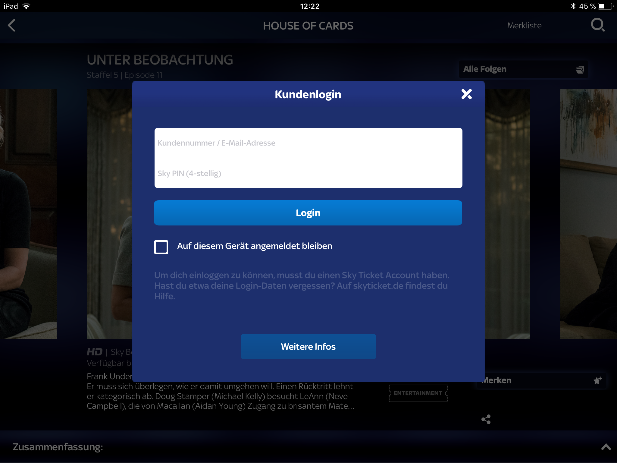 The first thing that a user needs to do of course is to log in. Sky requires you to register with an email address and a 4-digit pin (which is a whole other topic on it own…). This pin is probably supposed to make it easier for you to log in especially on devices that do not have a dedicated keyboard such as TVs.
The checkbox labeled
The first thing that a user needs to do of course is to log in. Sky requires you to register with an email address and a 4-digit pin (which is a whole other topic on it own…). This pin is probably supposed to make it easier for you to log in especially on devices that do not have a dedicated keyboard such as TVs.
The checkbox labeled Auf diesem Gerät angemeldet bleiben (stay logged in on this device) seems to have no effect at all unfortunately. The obvious improvement here is fixing this behaviour and remembering the login credentials. The light-version of this would be to just remember the e-mail-address since even though the PIN is only 4 digits the e-mail is on average 23 characters which becomes very bothersome to type over and over again. Not saving it also adds no additional safety benefits as the device itself is probably not shared and if so only available to trusted users (and you still need the additional pin).
Continuing playback
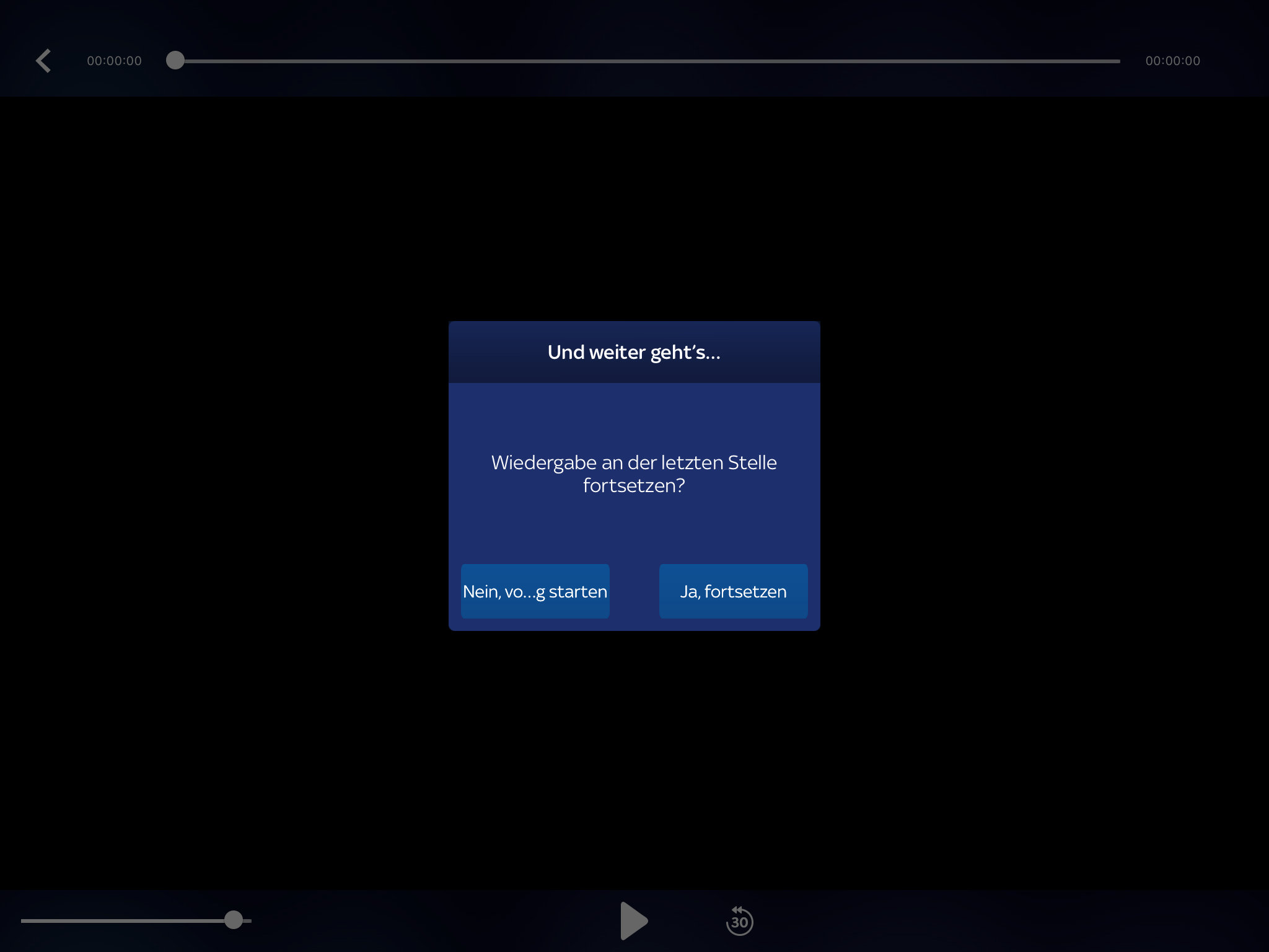 One of the recently added features to the app is the option to continue playback where it last stopped. This is a feature that is quite sensible as most people will probably be watching series with it. The way that this feature was implemented just turns out to be an annoyance though. Whenever the user opens an episode that they have already started watching they are greeted with a screen that asks them if they want to continue playback or start again (which is not even completely readable).
The better solution here would be to just always continue playback (which some monitoring would probably confirm is what most people want to do anyways). This way - in the case where users want to continue playback - no user input is required. If the playback continues even though people want to start from the beginning, it only requires them to move the scrubber back to the beginning of the timeline which is only one interaction as well.
Session handling
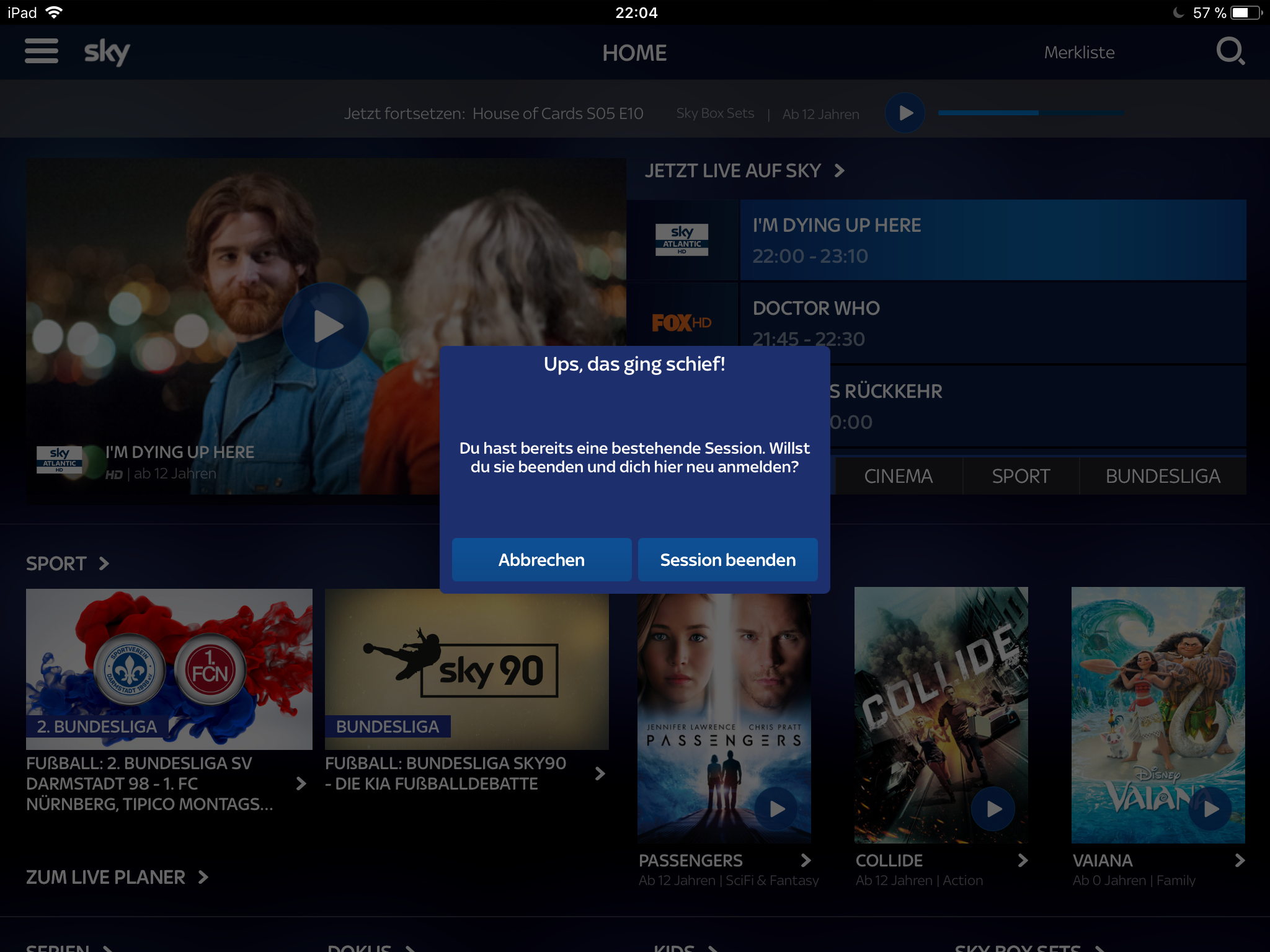 Lastly, again and again you get to see this popup which seems to show up for no reason. On my device it popped up a couple of times even though the iPad is the only device I ever used the app on. If you do not hit
 Abbrechen (abort) here you cannot watch anything so it might make sense to just always log out the user automatically or rephrase this to something like
Du bist auf einem anderen Gerät angemeldet.
Wenn du hier eine Serie gucken möchtest, musst du dich auf dem anderen Gerät abmelden.
Möchtest du auf dem anderen Gerät abgemeldet werden? [Ja] [Nein]
You are logged in on another device.
If you want to watch on this device you need to log out on the other one.
Should we log you out there? [Yes] [No]
Smaller details
- When searching group the results by TV show to make it easier to scan (already seems to do this but a small heading would be super useful)
- Remember what language I usually watch a show in (at least on a per series basis if not global). This is probably the easiest win as this is another interaction that I have to do every single time I start watching a show and every single time it lessens my enjoyment of the experience
Summary
All in all there are a lot of places where the app can be improved. I think this is a great example for where user testing or monitoring (e.g. 95% of all users always choose accept here, let’s just remove the popup and move this into an option) could really help win over users which is one of the biggest task for an app that heavily relies on converting users over from a cheap trial to a more expensive monthly subscription.