I recently found myself in the situation where I was given a typical infobox to implement in css. A div with a border and an icon on the left. The difficulty: The icon was supposed to be positioned on the left border, directly at half of the height.
The final result was supposed to look like this:
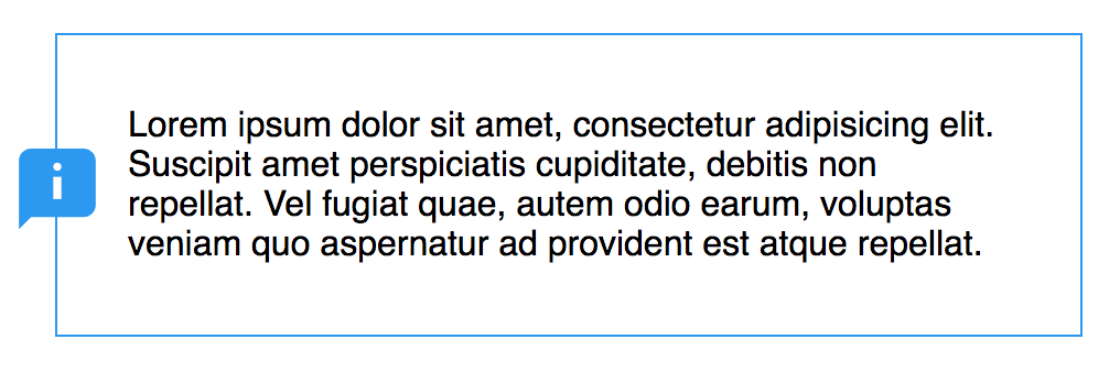
And the html was just this:
<div class="container">
  Lorem ipsum dolor sit amet, consectetur adipisicing elit. Suscipit amet perspiciatis cupiditate, debitis non repellat. Vel fugiat quae, autem odio earum, voluptas veniam quo aspernatur ad provident est atque repellat.
</div>
I will present the way from how I would have implemented this a couple of years ago to how I implemented it this time.
The basic css looks like this (all positioning excluded)
.container {
  margin: 2em;
  border: 1px solid #2296f3;
  padding: 2em;
  max-width: 400px;
}

.container:before {
  content: '';
  background: url(https://openclipart.org/download/280959/1496637751.svg);
  width: 44px;
  height: 44px;
}
Positioning the icon nicely used to be rather difficult because in order to position an icon in the center you need to know the dimension of the icon and the height of your info box. In our example the height of the icon is 44px and the height of the box shall be 300px. We can position the icon as follows:
.container {
  height: 300px;
  position: relative;
}

.container:before {
  position: absolute;
  left: -22px;
  top: 128px; /* (300px / 2) - (44px / 2) */
}
This works but will be problematic if the length of the text in the infobox becomes dynamic (e.g. because it will be translated to another language). If the text grows too large it might not fit our fixed 300px anymore and start to flow out of the container.
Fortunately all major browsers now support the calc feature. calc lets you define calculations to be carried out. This means that we can change our code to the following:
.container:before {
  position: absolute:
  left: -22px;
  top: calc(50% - 22px);
}
This is much better and adopts to a change in size. We know that we want to position the element in the middle (at 50%) but we need to subtract half of its height so that it is not slighty shifted towards the bottom. CSS calculations allow us to do just that.
The only annoyance with this implementation is changing the size of the icon. If we decided that the icon should be bigger, we need to make this change to four properties: width, height, left and top. To circumvent this, we can use the new css variables (officially called custom properties) which let us define variables like we know them within css. This means that we can change our code to this:
.container:before {
  --img-size: 44px;
  --img-center: var(--img-size) / 2;

  width: var(--img-size);
  height: var(--img-size);
  left: calc(var(--img-center) * -1);
  top: calc(50% - var(--img-center));
}
Here we are defining our image dimension in a variable called --img-size (css variables always have to start with --) which allows us to change the dimensions in just one place and let it propagate to all the places where it is used. This does not work in IE but you could for example use Sass to achieve the same result.
The cool thing about css variables as opposed to pre-processors is that you can change them on the fly. I made an interactive version that allows you to play around with this on codepen.